This store requires javascript to be enabled for some features to work correctly.
Written by Kathryn O’Shea-Evans | Photography by Annie Schlechter
Peter Dunham’s clients had a big problem with the Hamptons: They were buzzing. And I’m not alluding to the latest trendy boîtes teeming with well-heeled scenesters. The Southampton beach house the couple had rented, within walking distance to the village, “was incredibly noisy because people clipped hedges and mowed lawns all week long,” explains Dunham. “It was kind of a good thing for them to figure out, This is driving us nuts!” Silence—save for the lapping of waves—became a coveted amenity. Plus: “The husband is a water man,” the Los Angeles–based designer says. “Restricted in a suburban house behind hedges, it’s no wonder he was withering.”
After looking at nearly 60 homes, his clients splurged on an 8,800-square-foot, 7-bedroom, 9-bath house on a cliff overlooking glimmering Shinnecock Bay. The lone issue? It was a new spec house, nearly devoid of soul. In came Dunham, the France-born, England-trained prince of patterned prints. “In all these spec houses, you need to layer in some personality. You have to give spaces their identity.”
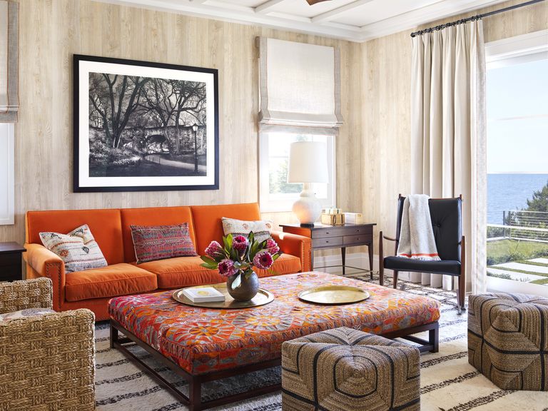
Dunham began by sheathing much of the interior in Benjamin Moore’s Simply White (“it’s clean, it’s airy, it’s bright”). Key rooms, on the other hand, received a colorful treatment: “You’re looking for ways to vary the notes so the whole house is not blue and white.” The designer installed a real wood wallcovering—de facto planking—in the den, and custom blue milk paint in the downstairs guest bedroom.
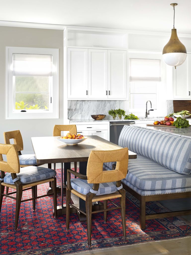
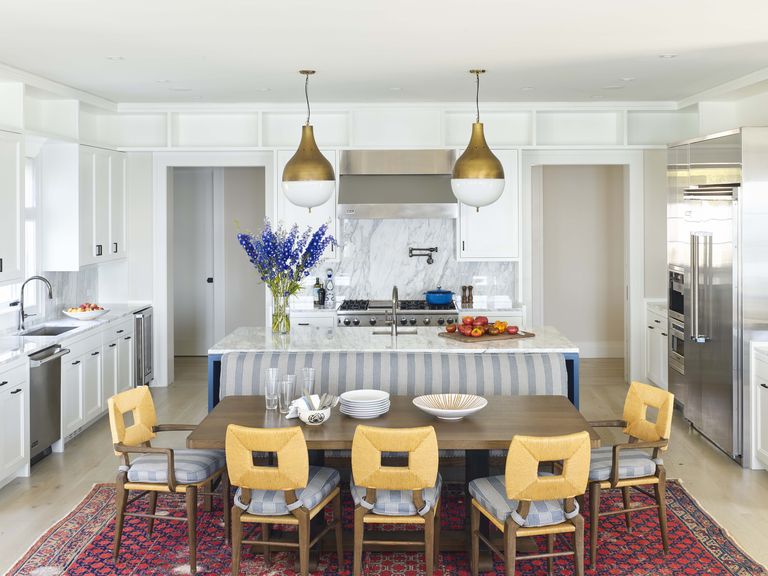
Because the couple have two frequently visiting grandchildren and another on the way, they asked for fuss-free, hard-wearing materials. Dunham selected performance fabrics and bold antique carpets that could take a beating (because they already had—for decades).
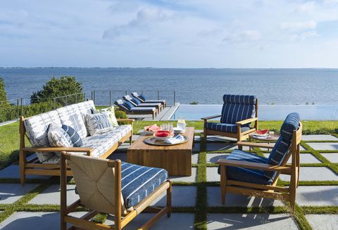
Throughout, abundant pattern cuts any sameness. But how do you mix prints without summoning a dizzy spell? “It’s a balance, almost like cooking, the way you have a rich sauce next to a plain piece of fish,” Dunham says. “I’ll add something like a paisley with stripes and then throw some solid in with the trim.” The final effect is as lively and deep as the bay beyond the windows. “To me, the atmosphere is way more important than the look,” Dunham says. “You don’t want guests to feel intimidated by your 10,000-square-foot house on the water. It should feel like they can kick off their shoes.”
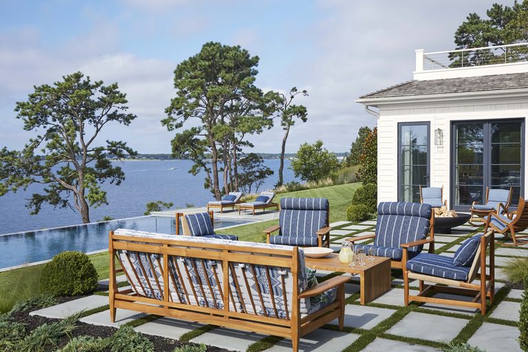
“It’s so rare to have trees between the house and the view; these big pines make it feel like the South of France to me,” says designer Peter Dunham of this Hamptons, New York, home. Furniture:Peter Dunham Home.
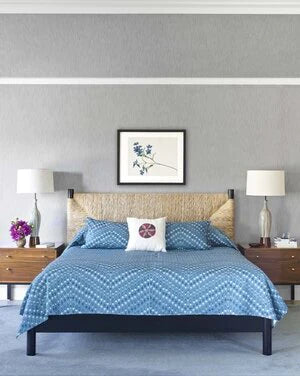
“We had a custom silk-wool carpet woven to mimic the ocean,” Dunham says. “When the couple are in bed, their perspective feels almost eternal. You don’t really see where the sea ends and your room begins.” Wallcovering and curtains: Pindler. Sofa and chairs: vintage, Hollywood at Home. Table: custom. Bed: Hollywood at Home, with custom bedcover in Peter Dunham Textiles. Art: vintage.
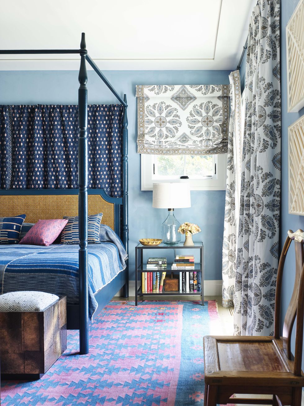
“This is the room everyone walks by when you’re coming into the house,” says Dunham, “so it’s got to be what the Duke of Devonshire would call ‘the state bedroom.’” Bed frame and bedding: Hollywood at Home. Bed-hanging: Peter Dunham Textiles. Wall paint: custom, Milk Company Paint. Stools: 1970s Paul Evans, LA Modern. Lamp: Pottery Barn. Rug: vintage Indian dhurrie.

